animation-timing-function
animation-timing-function プロパティはアニメーションがどのように進行するかを指定します。
プロパティの詳細
- 値
- ease, linear, ease-in, ease-out, ease-in-out, cubic-bezier(p1, p2, p3, p4)
- 初期値
- ease
- 対象
- すべての要素、::before, ::after 疑似要素
- 継承
- しない
- CSS レベル
- CSS 3
値の詳細
- ease
- cubic-bezier(0.25, 0.1, 0.25, 1.0)と同じ。ゆっくり開始し中央に向けて加速しその後速度を落として停止
- linear
- cubic-bezier(0.0, 0.0, 1.0, 1.0)と同じ。一定の速度で動作
- ease-in
- cubic-bezier(0.42, 0, 1.0, 1.0)と同じ。ゆっくり開始し加速し停止
- ease-out
- cubic-bezier(0, 0, 0.58, 1.0)と同じ。速く開始し速度を落として停止
- ease-in-out
- cubic-bezier(0.42, 0, 0.58, 1.0)と同じ。ゆっくり開始し速度を上げゆっくり停止
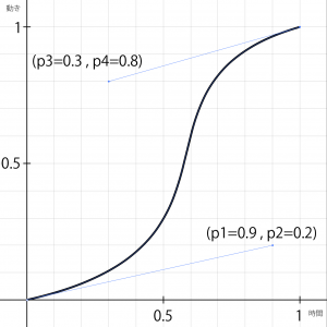
- cubic-bezier(p1, p2, p3, p4)
- ユーザー定義。二次元ベジェ曲線で制御点の座標を指定
例: cubic-bezier(0.9, 0.2, 0.3, 0.8)

サンプル
html
<div class="box1">
<p>アニメーションのテスト</p>
</div>
CSS
div#box1 {
	animation-name: animation;
	animation-duration: 2s;
	animation-iteration: ease;
	animation-iteration-count: infinite;
	animation-direction: alternate;
	animation-delay: 0s;
	animation-play-state: paused;
	animation-timing-function: ease;
	overflow: hidden;
}

@keyframes animation {
	0% {
		width: 10px;
		height: 10px;
		background-color: #eeeeee;
		position: relative;
		left: 0px;
	}
	100% {
		width: 200px;
		height: 100px;
		background-color: #aaaaaa;
		position: relative;
		left: 300px;
	}
}